Keeper's Curse Level & Game Design
Hey all! This is the second blog post for this week where I will discuss the level design and game mechanics of Keeper’s Curse. I hope you enjoy the read!

The Thought Process
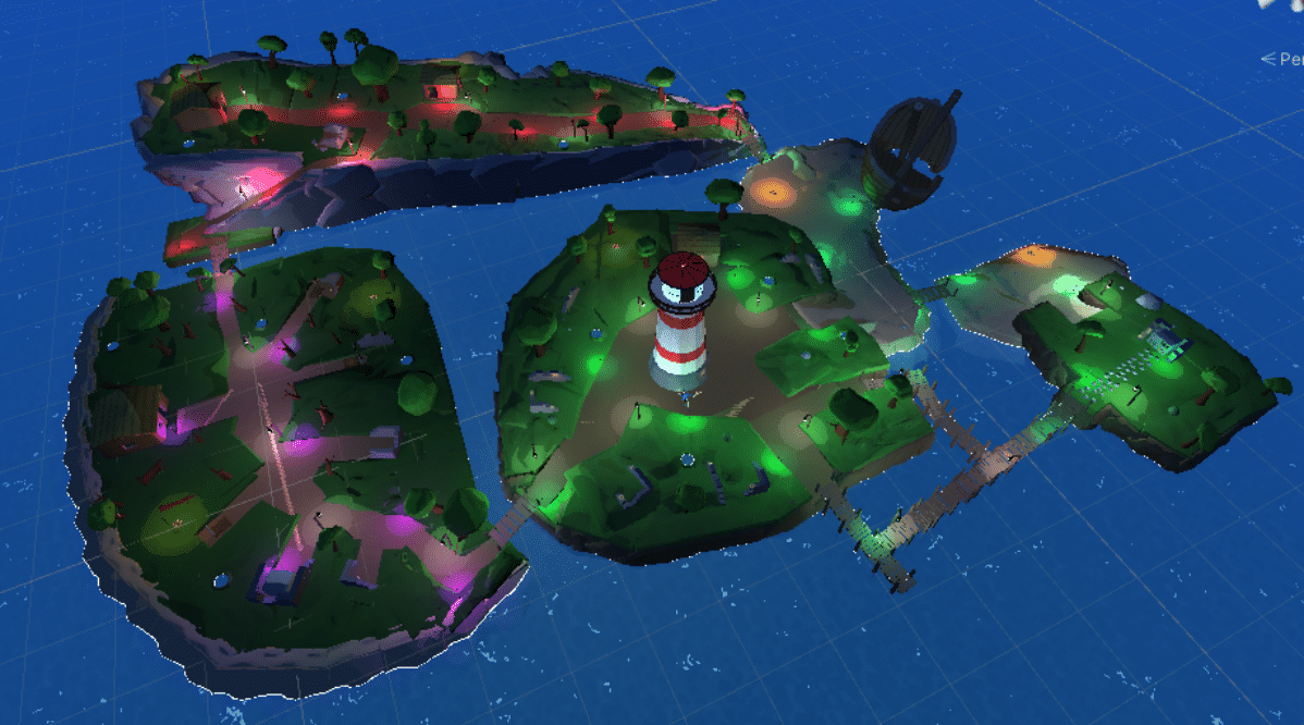
When designing the levels for Keeper’s Curse, I had to take into consideration multiple things that were very important to the quality of the design. Things including “Keeping in mind the core design philosophies of our game”, “Making sure the scale is acceptable”, and “Is each area interesting and providing something unique?”. We made sure that we did everything in our power to abide by these core design philosophies regardless of the situation as that is what makes a cohesive gaming experience for our players.

What Changed?
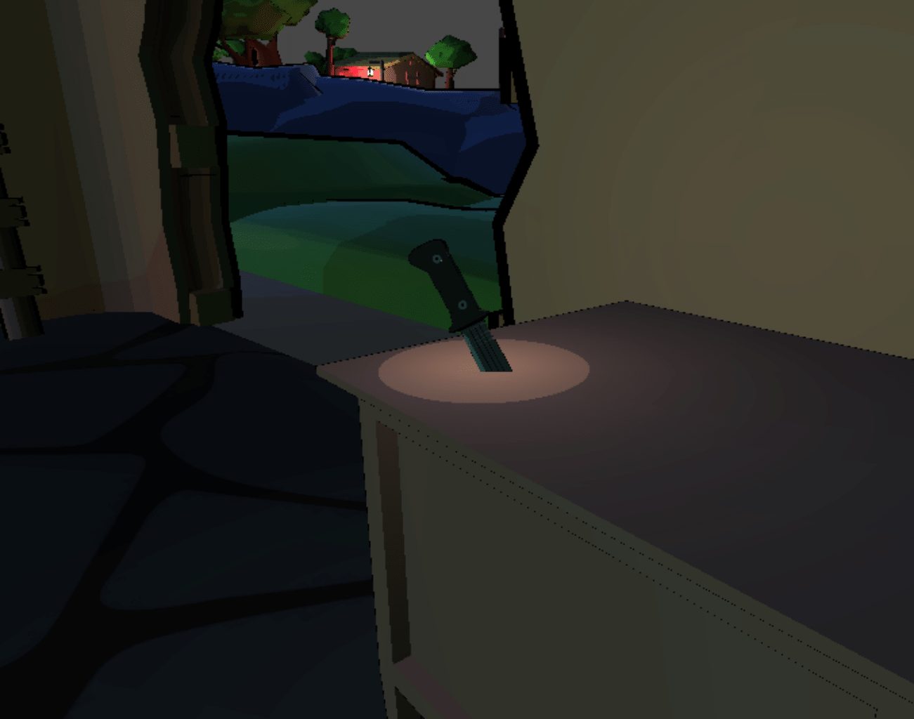
When developing a game you run into some issues that need to be addressed. We ran into the problem of our Harpoon weapon being much too powerful for how early you get it in the game, and this directly affected the core design philosophy of weapon experimentation as players would only use the harpoon. So we had a decision to make and we decided to lower the damage of the harpoon, we may even move it farther into the game so you don’t access it right away. We also tried replacing the starting knife with the harpoon to see if that works, so far the reception is mixed but we will keep trying until it’s perfect. This goes to show that with some clever thinking you can solve any issue as long as you understand that it’s an issue that needs fixing.

How we made the game with Modularity in mind
The thing with making video games is that having to create objects for every single thing is time consuming so when designing the game we specifically made it so that important things such as buildings and enemies as well as not so important things such as rocks and barrels are all able to be put in multiple places without messing with our lore. The enemies aren’t unique since they are just sea monsters and thus they can all look the same. The island used to have a cohesive village before the monsters came and so all the buildings look the same. As I like to say, play smarter not harder.
How we created meaningful and diverse enemies
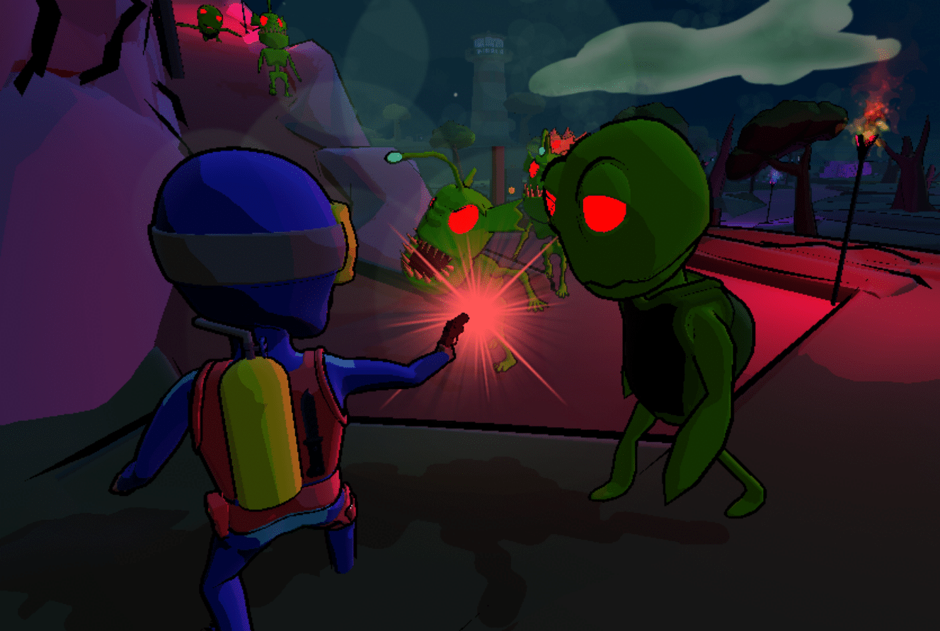
The enemies we created had to be not only unique to one another, but they also had to work well with the different areas we created. For Shipwreck Shores we had a central area with splitting paths and in response we added a basic all-around enemy that was perfect for any area as a starting ground for players. For Tombstone Ruins we had an area with more walls and thus designed the enemies to shoot at you from a distance, allowing the player to hide behind different walls for cover. For Demolished Precipice we had a much more open and squished area with not a lot of cover and so we designed the enemies to be quick and aggressive, sprinting at the player once it has line-of-sight. This makes the linear nature of the area an obstacle.

Which area is your favourite?
With all this in mind, which Area do you think is your favourite? Leave your answer in the pool below and feel free to leave any feedback, thoughts, or opinions in the comments section at the bottom of the page. We highly encourage it as we love to read or hear anything you have to share. Byte Size Studios takes into consideration all the comments posted, might even make a change to the final game! Back to our regularly scheduled blog posts on Monday!
